Edit buttons
Working with edit buttons
All editing control, as well as columns (For DBGridEh) and TFieldRow (For DBVerGridEh) contains two properties - EditButton and EditButtons.


EditButton specifies parameters for editing buttons. The buttons are displayed in the editing or editing control within the grid cell. To activate a button, use the property EditButton. If the control is necessary to have some buttons, create additional editing buttons collection EditButtons.
DefaultAction
The class TEditButtonEh added property - DefaultAction.
This class is used in components for TColumnEh DBGridEh, TFieldRowEh for DBVertGridEh, DBEditEh.EditButtons[i], DBNumberEditEh.EditButton, DBNumberEditEh.EditButtons[i], DBDataTimeEditEh.EditButton, DBDataTimeEditEh.EditButtons[i].
It specifies whether you want to perform a default action when you press the EditButton. Default actions depend on the component. For example, DBNumberEditEh default action is - the opening of a drop-down calculator. The other components of this will be another popup window for editing values. DefaultAction established in False, you cancel the opening of the pop-ups or other action by default.
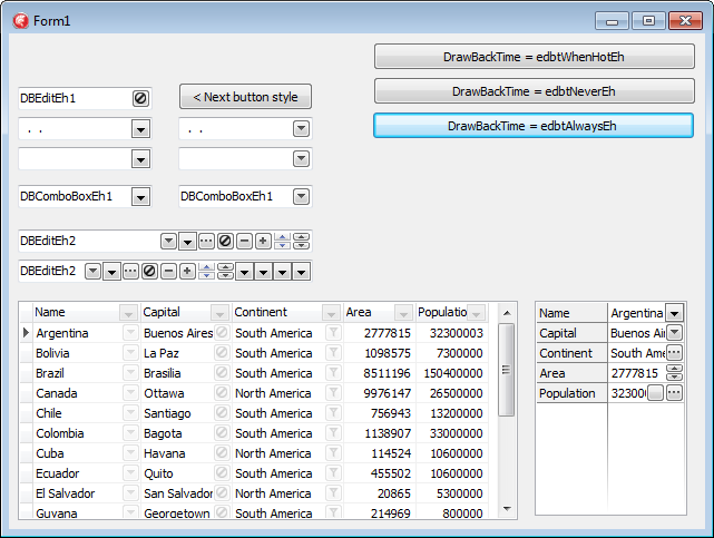
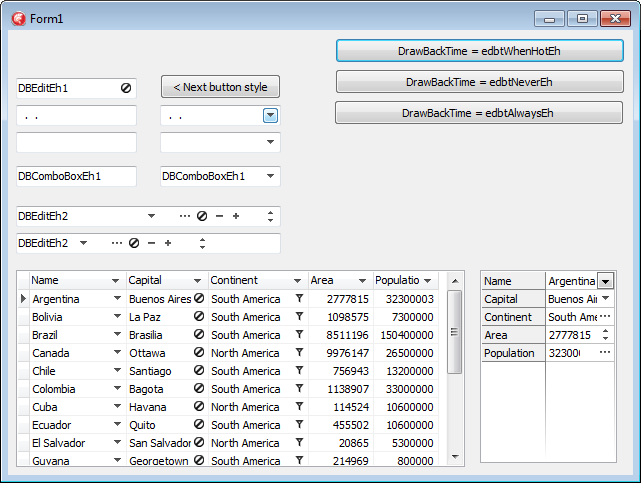
DrawBackTime
It is allowed display the edit buttons in transparent background mode. In this mode, the edit button shows only a foreground icon. See the second screenshort.
Limitations and Compatibility:
Not all types of buttons correctly support the drawing mode. For example such types as ebsDropDownEh ebsUpDownEh use Windows style to draw data and they can’t draw Background and Foreground part separately. For these buttons use alternative types - ebsAltDropDownEh and ebsAltUpDownEh.
Transparent back drawing does not work when the button have ebsGlyphEh style and the picture is in the Glyph property. To get around the restriction move a picture in TImageList component and fill EditButton.Images property.
Use the following types of properties to set a transparent background for Buttons:
Types
TEditButtonDrawBackTimeEh = (edbtAlwaysEh, edbtNeverEh, edbtWhenHotEh);
edbtAlwaysEh – Always draw the button background
edbtNeverEh – Never draw the button background
edbtWhenHotEh – Draw button background when a mouse cursor is over the button.
Properties
property TColumnEh.EditButton.DrawBackTime: TEditButtonDrawBackTimeEh
property TColumnEh.EditButtons[i].DrawBackTime: TEditButtonDrawBackTimeEh
Sets a drawing mode for button background in the column editor.
property TColumnEh.EditButton.DrawBackTimeStored: Boolean
property TColumnEh.EditButtons[i].DrawBackTimeStored: Boolean
Determines that the value of a DrawBackTime property is persistent and does not depend on the value of other properties. If DrawBackTimeStored = False, the default value for the DrawBackTime property is taken from TDBGridEh.ColumnDefValues.EditButtonDrawBackTime property.
property TDBGridEh.STFilter.FilterButtonDrawBackTime: TEditButtonDrawBackTimeEhSets a drawing mode for button background of STFilter buttons.
property TDBGridEh.STFilter.FilterButtonDrawBackTimeStored: BooleanDetermines that the value of a FilterButtonDrawBackTime property is persistent and does not depend on the value of other properties. If DrawBackTimeStored = False, the default value for the FilterButtonDrawBackTime property is taken from TDBGridEh. ColumnDefValues.EditButtonDrawBackTime property.
property TDBGridEh.ColumnDefValues.EditButtonDrawBackTime: TEditButtonDrawBackTimeEhSets a drawing mode for column editor buttons and STFilter buttons.
Similar properties are present in the classes of DBVertGridEh component
property TFieldRowEh.EditButton.DrawBackTime: TEditButtonDrawBackTimeEh
property TFieldRowEh.EditButtons[i].DrawBackTime: TEditButtonDrawBackTimeEh
property TFieldRowEh.EditButton.DrawBackTimeStored: Boolean
property TFieldRowEh.EditButtons[i].DrawBackTimeStored: Boolean
property TDBVertGridEh.RowsDefValues.EditButtonDrawBackTime: TEditButtonDrawBackTimeEh
Similar properties are present in the classes of TDBEditEh, TDBNumberEditEh, TDBDateTimeEditEh components
property TDBEditEh.EditButtons[i].DrawBackTime: TEditButtonDrawBackTimeEh
property TDBEditEh.EditButtons[i].DrawBackTimeStored: Boolean
For an example of using properties for transparent background see the next demo project:DEMOS\EditButton.DrawNoBack
OnClick, OnDown
You can write event handler on the mouse down click or mouse click of an Edit button. To do this, write an event handler or OnButtonDown OnButtonClick konrolya for editing. For TColumnEh (For DBGridEh) or TFieldRow (For DBVerGridEh) events have names OnEditButtonDown and OnEditButtonClick. If you create a button through a collection EditButtons, then write event of a collection TEditButtonsEh: TEditButtonEh.OnClick или TEditButtonEh.OnDown.
Properties
To adjust the display of edit button, use the following properties
TDBGridEh.ColumnDefValues.AlwaysShowEditButton – The property specifies whether to display the edit button in the grid constant. The value of a property applies to all the columns of the grid.
TColumnEh.AlwaysShowEditButton – Specifies whether to display the edit button in the grid constant for a given any column.
TDBGridEh.EditButtonsShowOptions – Specifies additional parameters map editing buttons when TDBGridEh.ColumnDefValues.AlwaysShowEditButton = True or TColumnEh.AlwaysShowEditButton = True.
EditButtonsShowOptions property can contain the following values:
sebShowOnlyForCurCellEh - Display the edit button for the current cell in the grid
sebShowOnlyForCurRowEh - Display the edit button for the current record in the grid
sebShowOnlyWhenGridActiveEh - Display edit buttons only when the grid has input focus
sebShowOnlyWhenDataEditingEh - Display edit buttons only when the DataSet is in edit mode.
The TEditButtonEh class contains the following properties:
Action: TBasicAction
DefaultAction: Boolean
DropdownMenu: TPopupMenu
DropDownFormParams: TDropDownFormCallParamsEh
Enabled: Boolean
Glyph: TBitmap
Hint: String
Images: TEditButtonImagesEh
NumGlyphs: Integer
ShortCut: TShortCut
Style: TEditButtonStyleEh
Style drawing edging buttonsDropDown, Ellipsis, Glyph, UpDown, Plus, Minus, AltDropDown, AltUpDown
Visible: Boolean
Width: Integer